
How to Use the Color Wheel to Pick Colors That Work Together
| Transparency Note: This article may contain affiliate links. If you purchase through these links, we may earn a commission at no extra cost to you. These partnerships help us continue to provide high-quality, free content and decor inspiration. |
To master how to use the color wheel, think of it as a visual map of color relationships rather than a rigid set of rules.
Selecting the right palette requires balancing color temperature and adjusting between tints, tones, and shades. By identifying a primary base color and using structural color schemes (monochromatic, analogous, complementary, etc) to support your primary choice, you can systematically design a cohesive, balanced space.
Standalone colors do not dictate how a room feels; the relationships between those colors do. A color wheel provides a system for interior styling that keeps you from over-correcting with plain neutral colors or creating visual clutter.
This guide will break down how to use the color wheel to build foolproof palettes for your home. You will learn common design color terminology, master classic formulas for color harmony, and discover how to apply these rules to home decor layers like paint, textiles, and accents.
What is the Color Wheel?
Before diving into complex color combinations, we need to understand exactly what we are looking at. A standard 12-part interior design color wheel is built on a strict hierarchy.

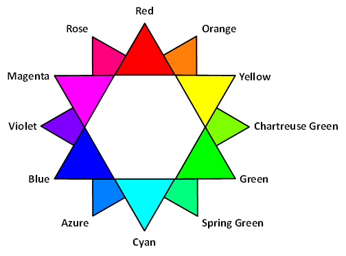
- Primary Colors: Red, yellow, and blue. These are the source pigments that cannot be created by mixing any other colors.
- Secondary Colors: Green, orange, and purple. These are formed by mixing equal parts of two primary colors.
- Tertiary Colors: Hues like blue-green (teal), red-violet (plum), or yellow-green (chartreuse). These occur when you mix an adjacent primary and secondary color together.
- Hues: A hue is the pure, raw identity of a color as it appears on the color wheel. It’s the basic color family name, e.g red, green, or blue-green, before any white, black, or gray is added to it.
However, if you only decorated with these 12 pure hues, your home would look like a primary school classroom. To make these colours more livable for an elevated aesthetic, you need to adjust their depth and saturation by using tints, tones, and shades.

Credits: of Hearth and Hue
Here’s what the breakdown looks like:
- Tint (Hue + White): This lightens the hue, turning a bold red into a soft blush or an intense blue into a breezy sky blue. Tints create airy, spacious environments.
- Tone (Hue + Gray): This desaturates the hue, toning down its vibrancy. Mixing gray into green gives you an olive or a chalky sage. Tones are the secret weapon of interior design because they look sophisticated and are easy on the eyes.
- Shade (Hue + Black): This deepens the hue, creating dark, moody colors. Adding black to red creates burgundy or oxblood; adding black to blue creates deep navy or ink. Shades introduce drama, intimacy, and depth.
How Do You Choose the Right Color Strategy?
Once you know how to soften or deepen a color, the next step is deciding how your colors will work together. Your choice depends on the mood you want to create and how much contrast you’re comfortable with.
1. Monochromatic (For a Calm, Cohesive Look)
A monochromatic color scheme uses one hue in different tints, tones, and shades. Instead of introducing new colors, you vary the lightness and depth of the same one.
This approach works well if you:
- Want a room to feel bigger and less visually busy.
- Prefer a timeless, minimalist look.
- Love color drenching, where walls, trim, doors, and even ceilings are painted in the same color family.
For example, a sage green room might combine pale sage walls, deeper olive cabinetry, and forest green cushions. Although everything belongs to the same family, the variation in value keeps the room interesting.
Pro tip: A monochromatic room relies heavily on texture. Pair matte walls with linen curtains, a wool rug, woven baskets, velvet cushions, or natural wood furniture to add depth without introducing new colors.
Analogous (For a Soft, Layered Space)
An analogous color scheme combines colors that sit next to each other on the color wheel, such as blue, blue-green, and green, or peach, coral, and warm pink.
Because these colors naturally share some of the same pigment, they blend together smoothly. The result is a room that feels harmonious without looking one-dimensional.
Choose this strategy if you:
- Want more variety than a monochromatic palette.
- Like layered, collected interiors.
- Want the room to feel calm while still having visual interest.
A living room, for example, might feature soft blue walls, teal accent pillows, and green plants. The colors are different enough to create movement but similar enough to feel connected.
Complementary (For Bold Contrast)
A complementary color scheme pairs two colors opposite each other on the color wheel, such as blue and orange, green and red, or yellow and purple.
These combinations create the strongest contrast, making each color appear more vibrant. Used thoughtfully, complementary colors add energy without overwhelming the room.
Choose this strategy if you:
- Want a space with personality and contrast.
- Want to highlight a focal point, such as a sofa, artwork, or statement chair.
- Like interiors that feel lively rather than understated.
The easiest way to use complementary colors is to let one dominate while the other acts as an accent. For example, paint the walls a soft slate blue and introduce warmth with terracotta furniture and accessories. Or start with an olive green room and add coral cushions, artwork, or a throw.
The Golden Formula: The 60-30-10 Rule
Knowing how to use the color wheel to pick your palette is only half the battle. The next challenge is deciding how much of each color to use. If you split a room 50/50 between two contrasting colors, they’ll clash and cause visual clutter.
Imagine a room with equal amounts of navy blue and burnt orange. While both colors are beautiful, they’ll be busy and visually tiring because they’ll be competing for attention.
That’s why interior designers rely on the 60-30-10 rule.
Instead of giving every color equal importance, this formula assigns each one a specific role.
- 60% creates the backdrop,
- 30% supports it, and
- 10% adds personality.
Think of it like an outfit: your jeans and shirt make up most of the look, your jacket adds interest, and your jewelry, belt, or shoes provide the finishing touch.

1. 60%: The Dominant Color
Your dominant color covers most of the room and sets its overall mood. You’ll usually see it on:
- Walls
- Large rugs
- Large built-in cabinetry
- Ceilings (sometimes)
- Large sofas in open-plan spaces
Choose a color that you won’t get tired of seeing every day. Soft neutrals, warm whites, muted greens, greige, and gentle blues are popular choices because they create a calm backdrop for everything else.
For example, a living room might have warm white walls, a large cream area rug, and built-in shelving painted the same warm white. Together, these make up roughly 60% of the room’s visible color.
Pro tip: If you’re unsure, let your wall color become your 60%. It automatically occupies the largest visual area.
30%: The Secondary Color
The secondary color adds depth and prevents the room from feeling flat. It usually appears on medium-sized pieces like:
- Sofas
- Curtains
- Dining chairs
- Bedding
- Accent walls
- Large storage furniture
This color should support—not overpower—your dominant color. For instance, if your walls are warm white, your 30% might be an olive green sofa, matching curtains, or an upholstered ottoman.
The room now has contrast without feeling busy.
Pro tip: Repeat your secondary color at least three times around the room so it feels intentional instead of random.
10%: The Accent Color
The final 10% is where your personality shines.
Use your boldest color on small, easy-to-change items like throw pillows, artwork, vases, lamps, throws, and decorative objects.
Because these pieces occupy very little visual space, you can afford to choose brighter or more dramatic colors.
For example, in the same warm white and olive room, your accent color could be terracotta. You could choose to use it on two throw pillows, a ceramic vase, artwork, a throw blanket, etc.
Notice how the room feels lively without being overwhelming?
Pro tip: If you like following seasonal trends, keep your 10% interchangeable. Swapping cushions, artwork, or accessories is much cheaper than repainting walls or replacing furniture.
Practical Examples: Mapping the Wheel to Real Rooms
Now, let’s bring that closer home.
To see how these concepts translate into practical interior styling, let’s explore two step-by-step room designs using different color wheel strategies.
Example 1: The Serene Analogous Living Room
The Concept:
A calm, nature-inspired space using neighboring hues on the wheel.
Color picks: sage green, celadon, and muted teal.

60% Dominant: A soft, chalky sage green paint on the walls. This provides an organic, modern neutral foundation that acts as a canvas for the rest of the room.
30% Secondary: A comfortable cream sofa paired with rich, textured celadon-glazed curtains and a light oak coffee table.
10% Accent: Deep muted teal throw pillows and a dark green ceramic table lamp to introduce depth and anchor the eye.
Example 2: The Sophisticated Complementary Bedroom
The Concept:
A balanced, high-contrast room using direct opposites on the wheel
Color picks: earthy plum and warm gold.

60% Dominant: A deep, moody plum or charcoal-grape shade painted across the walls using the color drenching technique to create a cozy, cocooning environment.
30% Secondary: A light linen duvet, a soft beige wool rug, and warm walnut nightstands to provide a clean visual rest area from the dark walls.
10% Accent: Warm mustard gold velvet pillows, a brass metal task light, and artwork featuring amber undertones to make the deep plum walls come alive.
Foolproof Tips for Testing and Finalizing Your Palette
Before you spend money on paint, furniture, rugs, duvets, decor,etc, take a little time to test your color palette in your actual space.
See Colors in Your Room’s Lighting
Natural light can completely change how colors look. North-facing rooms often make colors appear cooler, while south-facing rooms bring out warmer tones. Whether you’re choosing paint, a sofa, or curtains, view color samples or products in your room at different times of the day whenever possible.
Compare Your Choices Together
Don’t judge each item on its own. If you’re shopping in-store, gather paint chips, fabric swatches, or flooring samples. If you’re shopping online, create a simple digital mood board using product photos.
Seeing your wall color, furniture, rugs, and accessories together in your actual space makes it much easier to tell if the palette feels balanced.
Look Beyond Product Photos
Online product images don’t always show colors accurately. Check customer photos and reviews to see how the item looks in real homes and different lighting conditions. This can help you avoid surprises when your purchase arrives.
Final Thoughts
Learning how to use the color wheel doesn’t have to be complicated. Once you understand a few basic color schemes and pair them with the 60-30-10 rule, choosing colors becomes much easier. Instead of guessing, you’ll be able to create a home that feels balanced, cohesive, and reflects your personal style.